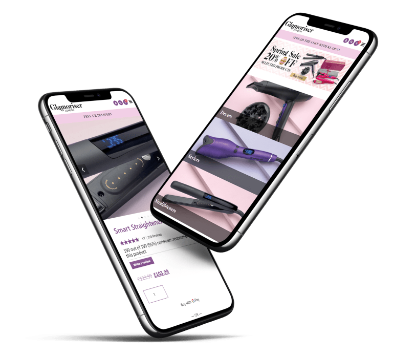
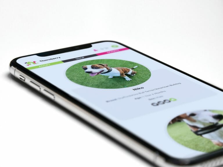
It isn’t a secret that we all live in a mobile world. Gone are the days of sitting in front of a desktop computer, logging on to browse the internet. Today over 59% of web traffic comes from mobile devices alone and sites like Google are predominantly using the mobile version of the content for indexing and ranking, historically done using the desktop version. So it’s never been more important to ensure your online presence is built with this in mind, and mobile first design is the best way to do this. Here is some advice from a local web designer.
What is mobile first design?
User experience is the most important factor to consider when building your website. When a user lands on your page on their mobile device, are they able to do everything they need to easily? Or has the website been designed for desktop and later tested on a mobile device? If so, this probably means that the user experience on mobile is not sufficient and so you need to decide how to improve this. Either thoroughly test your current site and adapt it with mobile first design concepts, or look into redeveloping your site completely with mobile first design best practices.
This concept refers to designing and creating your website for mobile devices initially before designing for larger screens e.g. desktop computers. Although we now know most people access websites through their mobiles, most websites are still built for desktops and later tested on mobile in the hopes they work here too. Although this may work in some cases, the majority of websites will become laggy and slow done this way.
Mobile first design means prioritising mobile users and their user experience and then scaling up the design for larger screens.
Best practice for mobile first web design: Design around your content
One of the biggest mistakes made in web design is in creating a beautifully designed website and then trying to fit content in afterwards, meaning information might not flow as effectively as it could. Planning your content and then designing the website around this will ensure your message will be communicated and consumed well.
When considering content, have the mobile version of your website in your mind already, as this pushes you to condense the information and wording to fit the smaller space available on mobile devices. You will be forced to remove unnecessary content that adds little to no value or that require more steps to access and so with less content to load, your website will load faster and be much easier to navigate, even more so when later transferred to the larger desktop version.
Create intuitive navigation
Remember, if users cannot find the information they’re looking for quickly, they are likely to look elsewhere within a few seconds. This is why the navigation structure of your website is so important. It’s not simply about ensuring all relevant information is available on your website ‘somewhere’. It’s about organising your content in a way that makes sense, is easy to navigate and flows well from initial message to completion of call to action. Creating this through mobile first device will ensure navigation works even more effectively on desktop versions too.
Simple, clear design
When visiting quality websites, you’ll notice how minimalistic the design is and how clear the information can be found. Fussy designed websites packed with images and text will not only overwhelm your users senses, but will also make your website feel dated, which is a sure way of creating a lack of trust from your users in the website’s legitimacy.
You don’t need to compensate for the style and personality of your website in order to keep things simple. It’s a case of selecting the most effective text, images and links to perfectly suit your message and leaving out the rest.
Visible Call to Action
Call to Action buttons (CTA) are your website’s most valuable links as these are usually the first form of communication between you and your customers via your website. They therefore need to be easy to find and use. When using mobile first design, we take into consideration the fact that users are navigating through the site with their fingertips and so need these CTA’s to be large, bold and visible to ensure these are effectively taken advantage of.
Making the most of responsive web design
Your website should work smoothly across all devices, from desktop, tablet to mobile. This is responsive web design and can be done quite easily through a well chosen WordPress theme created to adjust and test your website to fit and work well on different devices as it’s built. Start with mobile first, adapt to desktop after and use WordPress’ Block Visibility plugin to ensure no unwanted blocks take up space – simply make these visible or invisible across your different devices for best user experience.
The Benefits of Mobile First Design
- Better user experience
- Improved performance
- Better search engine visibility
- More conversions
Want to learn more about mobile-first design from a Local Web Designer near me? Request a call back with us below and/or view our web design projects here