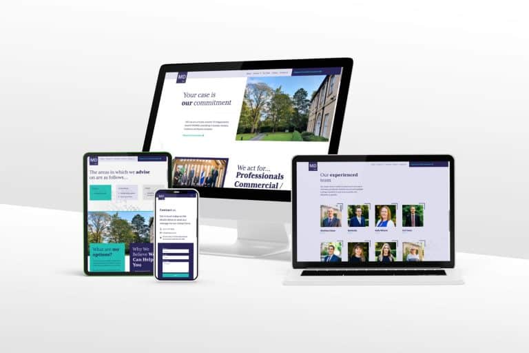
As a small business owner, your website is the first opportunity to make a good, lasting impression to potential customers. This is where they’ll find out who you are and what you’re about as a company. With the pressure of making a good impression, it can be easy to make a few mistakes on the way to designing your website. These can be make or break to the success of your website and therefore lead conversion.
Here are our top tips to avoiding common mistakes small businesses could make in designing their website:
- Making your purpose clear!
Before you start thinking about design, you need to be sure of your purpose and goal for your website. What do you aim to achieve in having this website? Are you selling products or services? Providing information and advice? Are you looking for exposure or to simply generate leads to your business? Having a clear goal will help you understand your design needs, from colour and layout to the links and calls to action.
- Don’t neglect your mobile users
In a recent 2022 survey, it showed that mobile users make up 49.8% of all web visits with desktop users only slightly higher at 50.2%, and this is expected to keep increasing in the next few years until mobile users are flying ahead! It’s therefore never been more important to ensure your website is completely mobile-friendly! This means your site is as easy to navigate and view on smaller screens and that necessary changes are made so that everything loads as quickly as it does on your desktop version. Neglecting this will see you lose out on a significant amount of your potential audience.
- Be aware of visual overload!
Whilst you want to make your website visually attractive, a clean site is key. It can be easy to get exciting and add lots of graphics and images because you think they’re all relevant to your business and individually look appealing, but this can be anything but appealing to your website as a whole. It can look overwhelming, make your website difficult to navigate and also load slower. You want to keep your design simple and clean, using only high-quality images and graphics that add value to your site rather than simply filling up the space!
- Image quality over quantity!
The quality of your images can have such an impact on how your website is viewed. Poor quality images will make your website appear unprofessional and messy, creating a lack of trust and interest from potential customers. Use high-resolution images, properly sized for web use and make sure these are all relevant to your business.
- Clear call-to-action
Calls-to-action are probably the most important element of your website. These are how you make that initial contact with your potential clients and ensure you’re able to gather necessary details in order to convert a visitor into a lead. Throughout your website, you should have clear call-to-actions to let your visitor know you need them to do something in order to move forward. This could be to make a purchase, get advice, sign up to a newsletter or request a call back to find out more. This call to action should be visual, give clear instructions and be easy to find and use.
- Responsive design
A responsive design means your website adjusts automatically depending on the type of device its viewed on (desktop vs. mobile). As earlier mentioned, mobile and tablet users are ever growing and will soon take over those numbers viewing on desktop and so if your website is not adapted properly to cater for these mobile users, they’re likely to go elsewhere and quick.
Follow these tips to avoid those common mistakes and create a site that perfectly meets your needs, promotes your business and appeals to your potential customers.
For more info on how we can help with your website, contact our team today.
